三草二木
品牌規劃,平面設計,包裝設計,網頁設計,商業攝影
2017.10.05
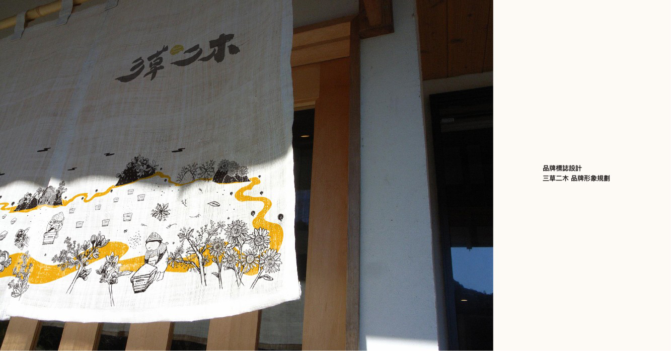
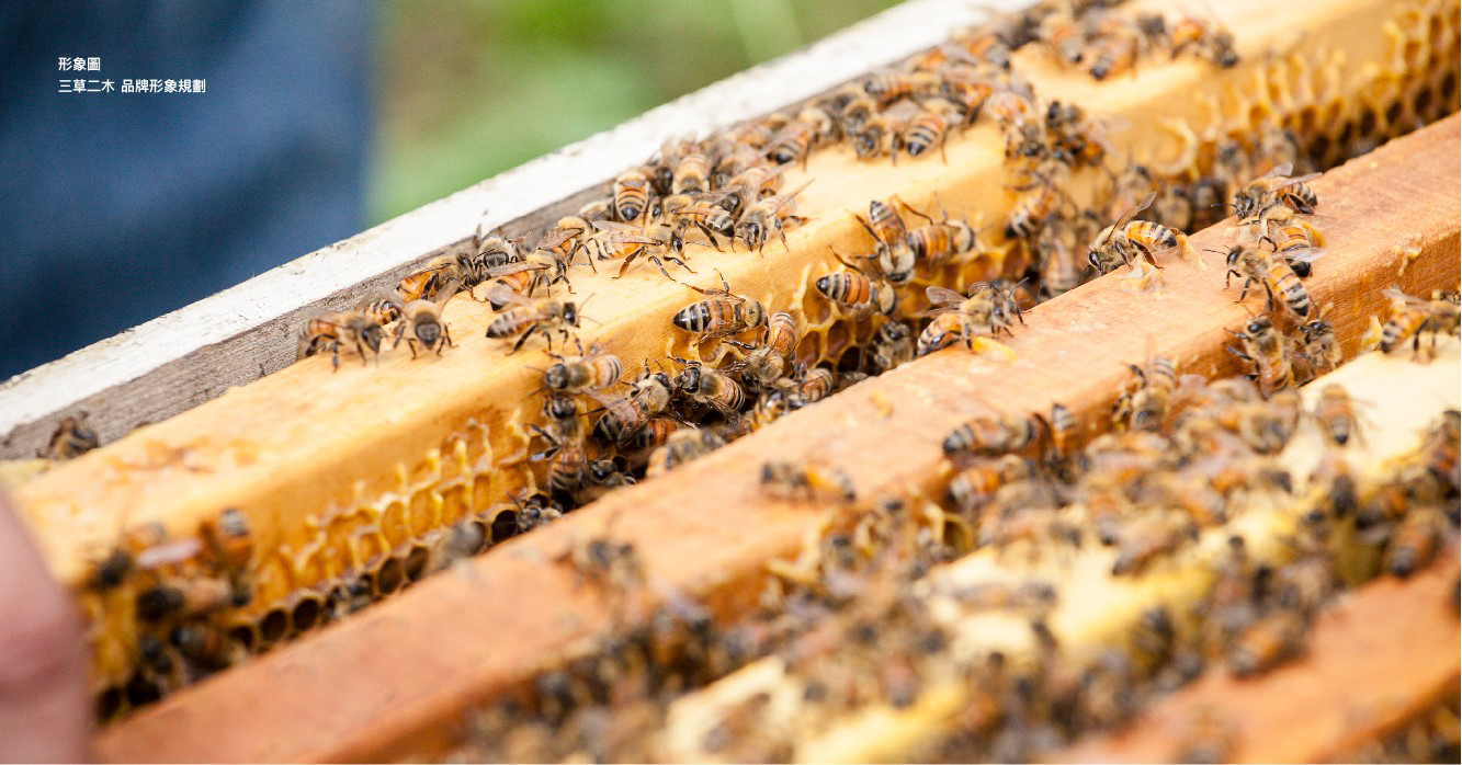
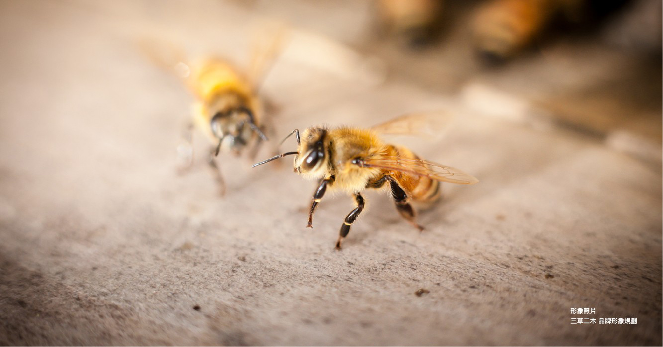
採蜜是一種逐水草而居的生活模式,養蜂人與蜜蜂共生,提供良好的生長環境,且不過度採收,這是我們與蜜蜂之間約定的共生法則。
本設計案榮獲2021美國謬思設計大獎 包裝類/金獎、2020德國國家設計獎及2019 IF德國設計獎,包裝類WINNER。
本設計案榮獲2021美國謬思設計大獎 包裝類/金獎、2020德國國家設計獎及2019 IF德國設計獎,包裝類WINNER。
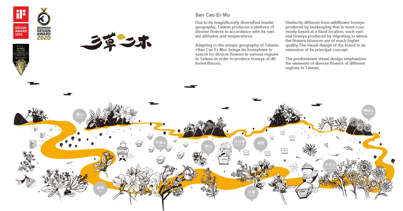
Due to its magnificently diversified insular geography Taiwan produces a plethora of diverse flowers in accordance with its variant altitudes and temperatures. Adapting to the unique geography of Taiwan
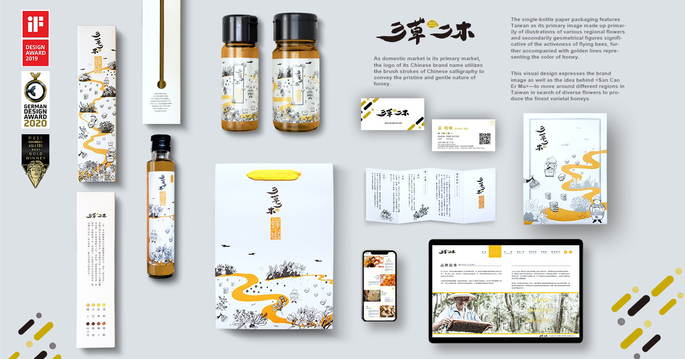
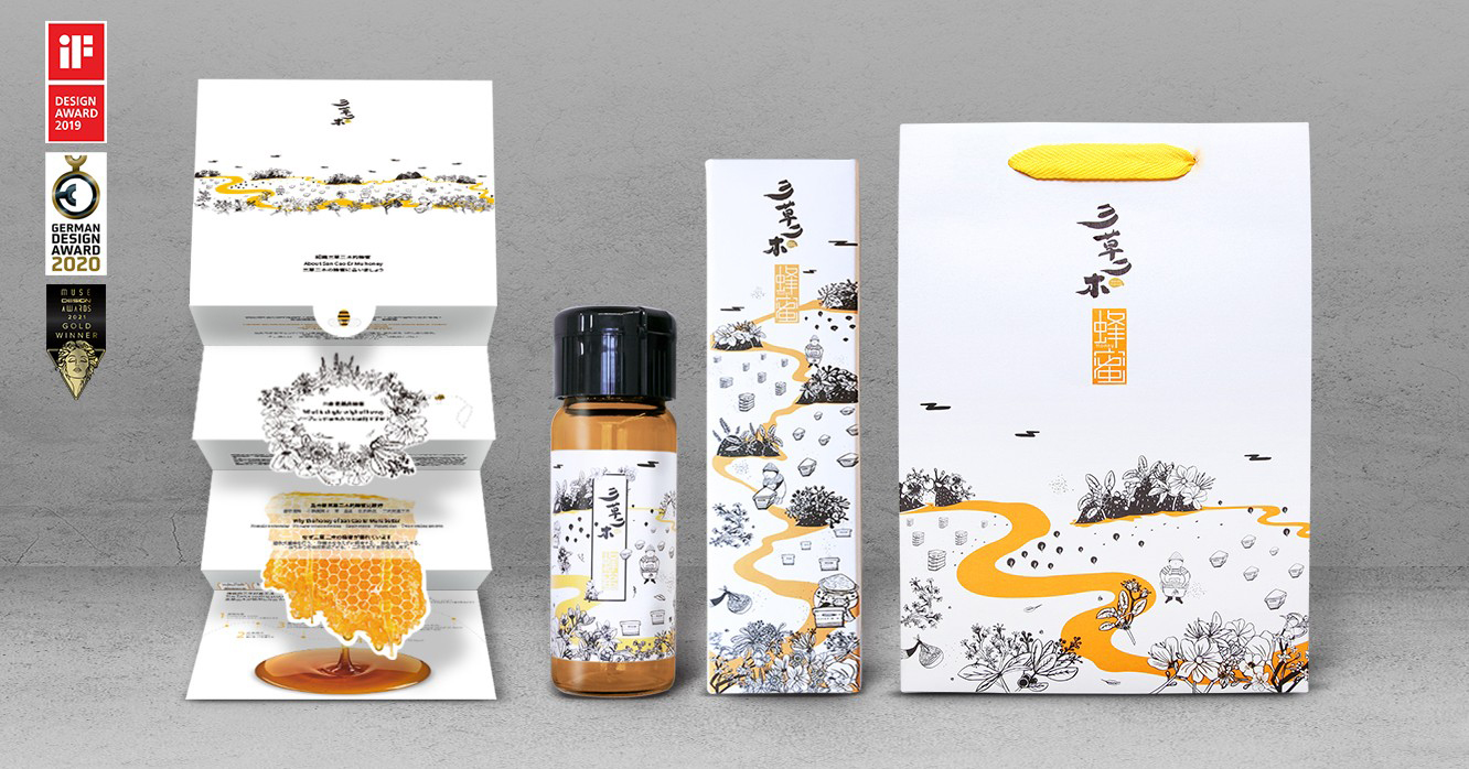
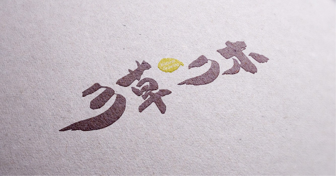
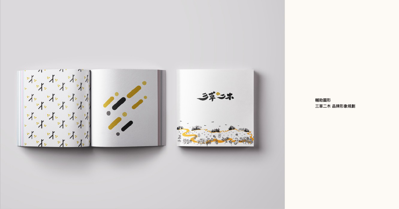
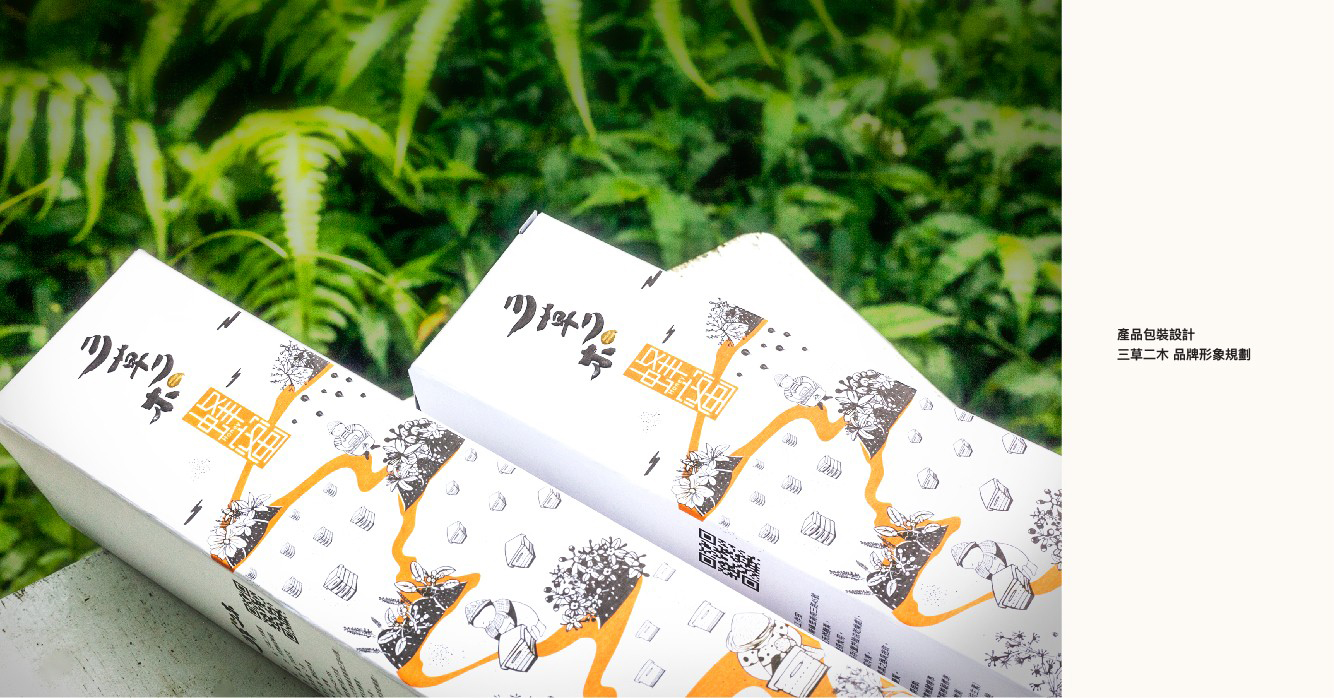
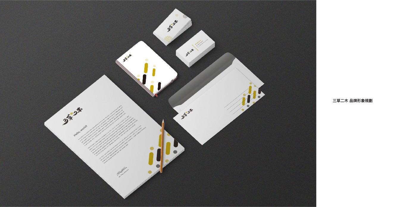
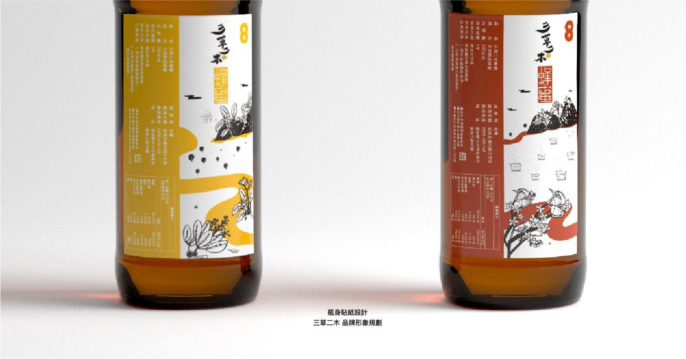
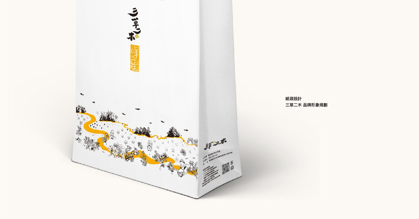
The visual design of the brand is an extension of its principal concept. The predominant visual design emphasizes the elements of diverse flowers of different regions in Taiwan. As domestic market is its primary market the logo of its Chinese brand name utilizes the brush strokes of Chinese calligraphy to convey the pristine and gentle nature of honey. The single-bottle paper packaging features Taiwan as its primary image made up of illustrations of various regional flowers and geometrical figures significative of the activeness of flying bees further accompanied with lines in golden color that is the color of honey. This visual design expresses the idea behind and its brand image—to move around different regions in Taiwan in search of diverse flowers to produce the finest varietal honeys.
